
As an artist, learning how to choose colors for painting can make or break your design, whether it’s a work of art or home decor palette. The colors you use can convey emotions, set the tone, and draw attention to specific elements in your design. With so many colors to choose from, the task of selecting a color palette can be overwhelming. In this blog post we’ll explore the art of finding color palette inspiration, and while I am focused on choosing a color palette for art, many of these concepts are applicable to choosing colors for your home or other design projects.
Understanding Color Theory
Before we dive into how to choose colors for painting, it’s essential to understand one of the seven elements of art; color theory. According to My Modern Met, color theory is “the science of how we perceive different hues and the creative way in which artists mix, match, and blend a wide range of colors to please the eye.” Even though there are officially seven colors in the rainbow (red, orange, yellow, green, blue, indigo, and violet), those colors can be mixed and combined to create infinite combinations.
The Color Wheel
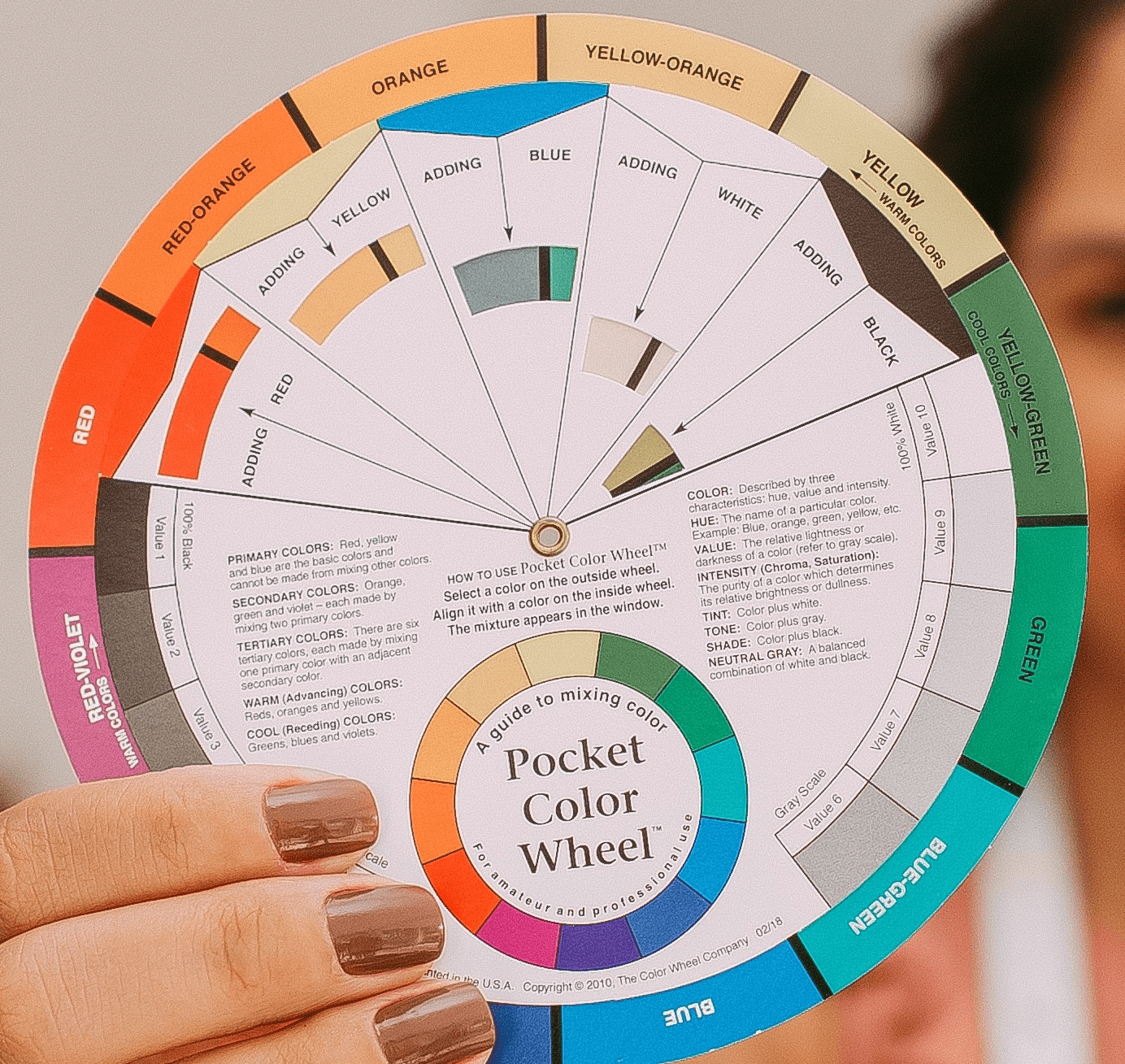
A color wheel is a valuable tool for artists and painters as it helps them to understand the relationships between colors and how they can be used to create different effects. Having students paint a color wheel from scratch is an activity many art teachers use to teach young artists color theory and color mixing firsthand. Below is an image of the color wheel my daughter painted in her high school art foundations class. Even though it is a learning tool, I think color wheel activities are very visually appealing too!

By using a color wheel, artists can choose a color palette for art with colors that harmonize well together or create contrast for visual interest. It also enables them to experiment with different color schemes, from monochromatic to complementary, triadic, or analogous, to achieve specific moods or emotions in their artwork. Additionally, the color wheel can help artists to make decisions about color temperature and saturation, leading to a more cohesive and balanced composition. In short, the color wheel is an indispensable tool for artists and painters to create beautiful and meaningful artworks.
Popular Color Schemes
Using the color wheel, artists can find color palette inspiration by choosing from many popular, “standard” color palettes based on the positions on the color wheel.
- Monochromatic schemes use one color in various shades, tints, and tones. For example, an artist could choose blue, but mix it with black and white to create multiple shades of blue, from deep to light, and create an entire painting with just blue tones. Monochromatic color schemes often have a calming feel, and can help create a harmonious, cohesive look.
- Complementary color schemes use colors that are opposite each other on the color wheel. The standard complementary colors are red and green, orange and blue, and yellow and purple. Color palettes created from complementary colors are loved for their drama. Complementary colors are a great way to create contrast, and when mixed in various shades using black and white, two complementary colors can create a very versatile palette.
- Split-Complementary color schemes use a base color with the two colors adjacent to its complementary color. This is where the color wheel can be very helpful for visualizing, since it might take some mental gymnastics to figure out these combinations. Split-complementary color schemes provide the drama and contrast that complementary color schemes offer, but also a balance of harmony due to the close position of the two adjacent colors.
- Triadic color schemes use three colors that are equally spaced apart on the color wheel. When used right, with one dominant color and the other two colors as accents, triadic color schemes can be vibrant. However if not balanced properly, triadic color schemes can be intense and potentially uncomfortable to the viewer.
- Tetradic color schemes use four colors arranged into two complementary pairs. On the color wheel, this would be represented by a rectangle drawn to connect the four colors. Because this uses both complementary colors and colors near each other on the color wheel, it can create beautiful, vibrant color palettes with a lot of visual interest.
- Analogous color schemes use colors that are next to each other on the color wheel. In addition to monochromatic color schemes, this is one of the easiest ways to create a harmonious color palette, and one of my favorite ways to start a painting.
Color Temperature
Another aspect of color theory to consider is color temperature. Warm colors like red, orange, and yellow convey energy and excitement, while cool colors like blue, green, and purple suggest calmness and serenity. Using color theory based on color temperature, we can adjust colors by warming them up or cooling them down. For example, if you want a “warmer” green, you could mix in some yellow, and if you desire a “cooler” green, you could mix in some blue.
Limited Color Palettes
Don’t feel like you need to use all the colors of the rainbow in every painting. The standard color combinations mentioned above are great starting points to work with limited color palettes. Additionally, even if you choose only three colors to start your painting, you can expand your palette and add depth by mixing the three colors you chose with each other, along with white and black to add shades. A limited color palette can be very effective, providing just enough creative limitations that still allow you to focus on color harmony and contrast.
Color Palette Inspiration Tips
Now that you have a solid foundation in color theory, below are some tips to inspire your color palette selection. Even if you have a favorite method for finding color palette ideas, challenge yourself to try each of these methods, as it will help you improve your painting skills.
Use Color Psychology to Convey a Mood
Colors have a psychological impact on our emotions, and you can use this to your advantage when selecting your color palette. For example, yellow is associated with happiness and optimism, while blue is calming and peaceful. You might choose colors based on your mood, or the mood which you want to convey in the painting. Keep in mind, colors can convey different meanings and moods across different cultures, so it’s important to understand your audience when considering colors for certain moods and emotions.
Another way to use color psychology for color palette inspiration is to consider chakra colors and what each represents. The concept of chakras originated in ancient Indian spiritual traditions, such as yoga and Ayurveda. Chakras are energy centers in the human body that are believed to be associated with physical, mental, and emotional aspects of the self. There are seven chakra colors, listed below, with their respective meanings.
- Root Chakra: Red – Represents stability, grounding, and security. It is located at the base of the spine.
- Sacral Chakra: Orange – Represents creativity, sexuality, and emotional balance. It is located in the lower abdomen.
- Solar Plexus Chakra: Yellow – Represents personal power, confidence, and self-esteem. It is located in the upper abdomen.
- Heart Chakra: Green or Pink – Represents love, compassion, and emotional balance. It is located in the center of the chest.
- Throat Chakra: Blue – Represents communication, self-expression, and authenticity. It is located in the throat.
- Third Eye Chakra: Indigo – Represents intuition, insight, and spiritual awareness. It is located between the eyebrows.
- Crown Chakra: Violet or White – Represents spiritual connection, enlightenment, and oneness with the universe. It is located at the top of the head.
Get Color Inspiration from a Photograph
Take a look at a photograph that inspires you and consider the colors present. You can use the photograph’s color palette as a starting point for your painting. You might use a color picker to highlight various shades from the photograph to help you put together a palette of three to five main colors that you can use to start your painting. Some ideas for finding photographs for color inspiration:
- Take your own photos from travel, walks outside, and of anything you find interesting. Keep your inspirational photos filed in a folder on your phone or computer and peruse when you are looking for color palette inspiration for your next painting.
- Keep a Pinterest Board for color inspiration. Whether you search Pinterest for things like interior design ideas or even specifically “color palettes”, you can pin anything that strikes your fancy to a board you can reference later. Searching Pinterest for interior design ideas is a great way to find trending color palettes, increasing the chances your painting will coordinate with current design trends.
- Google image search: if you have an idea for color palette inspiration but don’t have a photo for visual reference, search Google images and save what you like. For example, maybe you want to use the colors of a peacock, but need a reference photo. You can find plenty of images of peacocks on Google. Keep in mind, while it’s perfectly fine to reference the colors of a photo you do not have the rights to, never use the photo as an exact reference for your subject matter if you do not have permission from the owner.
Colors Inspired by Nature
Nature is an excellent source of color inspiration. Think of the colors of a sunset, the ocean, or a field of wildflowers. You might also consider animals and the various colors of their fur and feathers. When we use colors inspired by nature, there is an inherent sense of color harmony with those palettes because our eyes are used to seeing these kinds of color combinations.
Explore Color Palette Tools and Websites
There are many websites and books with hundreds of different color palette ideas already compiled. All you have to do is look through them and find one you like. Some of the online color palette idea websites have options to filter through them, so you can more easily dial in to something you’re interested in. Below are some popular color palette tools to check out:
- Canva: While Canva has many different templates and tools to help designers, they have a huge database of color palettes. You can browse from the main page or narrow your search with keywords.
- Color Palettes: This website shows reference photos with associated color palettes, with a few filtering options, including filter by one main color. It has easy sharing options so you can save your favorite palettes to Pinterest.
- Coolors: This color palette generator has a lot of interactive options. You can generate a color palette from an image you upload, but there are various tools to tweak your palette to your liking. You can also explore trending color palettes generated by other users.
- Color Hunt: What I like best about this website is that it shows how many people have favorit-ed each color palette displayed, so you can easily gauge if a color palette is trending or popular.
- Color palette books: If you prefer to keep a physical copy of color palette inspiration handy, search Amazon or your local bookstore for a book of color palette ideas. There are several top sellers, including The Complete Color Harmony, Pantone Edition, and Color Collective’s Palette Perfect.
Get Feedback from Your Community
Don’t be afraid to share your color palette choices with your community. Get feedback and see how others perceive your color choices. You can use social media polls if you are trying to decide between a few options for your next piece or collection, or create a poll for your email list to provide their input. Reaching out to your community for their input not only ensures your artwork will resonate with your audience, but also helps engage them to feel like an important part of the process.
Go With Your Gut
Sometimes, it’s exciting to just choose a few paint colors on a whim. Just look at your paint supplies and pick whatever stands out to you in that moment. This is one of the first steps to intuitive painting, and it’s a way to confidently know your work is created from the heart. There are reasons you are drawn to certain colors. Even if you aren’t clear what those reasons are, go with your gut and let the process of painting intuitively guide you through. This can be one of the most fun and validating ways to find color palette inspiration – when you trust what comes from within!
The Joy of Experimenting With Different Color Palettes
Choosing a color palette for your painting is a personal decision, and there are no right or wrong answers. Color palette inspiration is everywhere, whether you notice it in your surroundings or use a resource designed specifically to give you color palette options. There isn’t a wrong way to find inspiration for your artwork. The best way to find the perfect color palette is to experiment and try different methods for finding inspiration and color combinations. Use these tips to guide you, but ultimately trust your instincts and have fun with it. Happy painting!